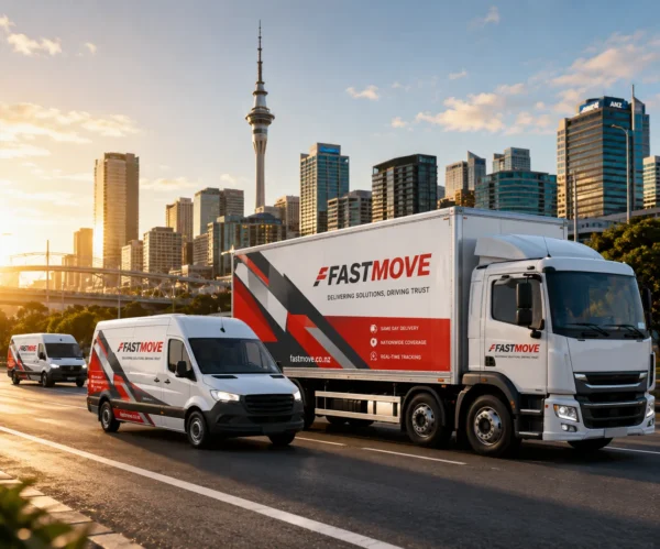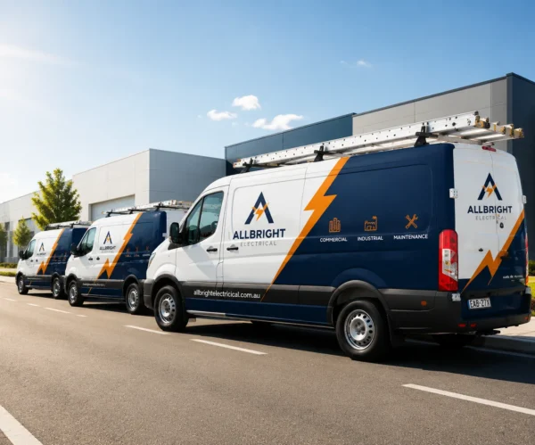
A standout commercial vehicle wrap doesn’t just cover your van or truck—it turns every drive into instant, memorable advertising. After hundreds of fleet branding projects, DEKA WRAP have pulled together the core design rules that guarantee your wrap grabs eyes on busy roads, boosts brand recognition, and delivers real customer leads.
Whether you’re wrapping one delivery van or an entire company fleet, these simple best practices will elevate your design from forgettable to unmissable.
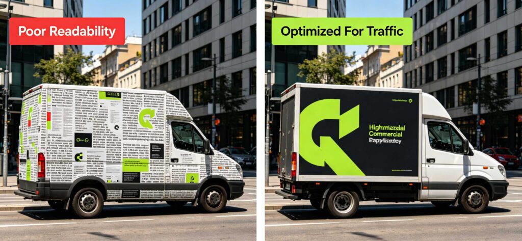
1. Prioritize Readability for Fast-Moving Traffic
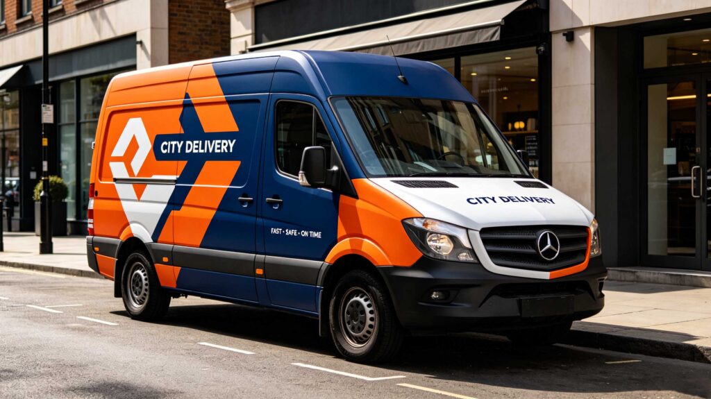
Pedestrians and passing drivers only get 2–3 seconds to absorb your wrap’s message.
- Use oversized, bold sans-serif fonts for business names, phone numbers and core services
- Keep critical contact info at eye level on van sides and rear doors
- Skip tiny decorative text that becomes unreadable from 10+ feet away
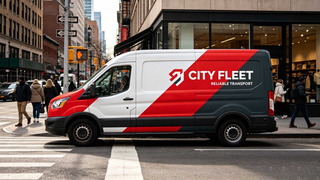
High contrast between text and background is non-negotiable: dark text on bright wraps, or light lettering on deep saturated color blocks.
2. Stick to a Tight, Consistent Brand Color Palette
Overcrowding your wrap with too many shades creates visual chaos that people glance past.
Limit your design to 2–4 official brand colors. Clean, cohesive color blocking makes your fleet instantly recognizable across town. Gradient accents are great for visual pop, but avoid mixing clashing neon tones unless your brand’s identity calls for it.
3. Keep Layout Uncluttered — Less Is More
Many business owners make the mistake of packing every service, award and social handle onto one panel.
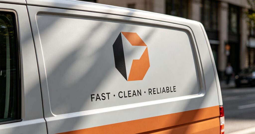
Too many graphics, logos and slogans overwhelm viewers. Focus on 3 core elements only:
1.Main brand logo (largest visual anchor)
2.1 clear service selling point (e.g., Same-Day Local Delivery)
3.One primary call-to-action (phone number / QR code / website)
Empty negative space lets key details stand out.
4. Add High-Impact Interactive Elements
Turn passive onlookers into potential customers with functional design features:
- Large, crisp QR codes on rear doors and side panels linking to quotes or booking pages
- Bold printed contact numbers visible from crosswalks and stoplights
- Short punchy taglines that highlight your unique advantage.
5. Match Graphics to Your Vehicle’s Body Shape
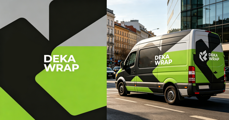
Don’t treat your wrap like a flat poster. Design around curves, wheel wells, door seams and window cutouts.
Place logos and key text on flat, unobstructed panels; avoid stretching critical graphics over bumpy or curved sections where printing can distort details. Professional designers build custom artwork tailored exactly to your van, truck or trailer model for a seamless premium finish.
6. Choose Print-Friendly Artwork for Long-Lasting Clarity
Low-resolution images turn pixelated once printed large-scale.
Work with printers that use UV or latex digital inks: these hold sharp detail, resist sun fading, and keep your wrap vivid for 5–7 years. Avoid blurry stock photos that cheapen your brand image.
7. Maintain Uniformity Across Your Entire Fleet
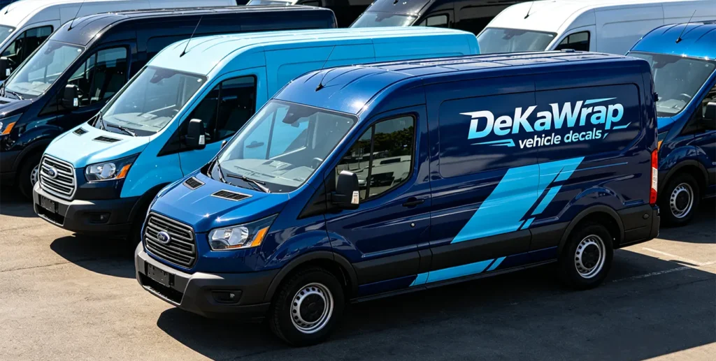
If you operate multiple vehicles, use identical base wrap colors, logo placement and font styles on every van or truck.
A unified branded fleet builds instant credibility. Customers trust businesses with polished, matching rolling advertising far more than random mismatched vehicles. Small custom tweaks (regional contact info, seasonal promotions) are fine—just keep the core brand design consistent.
Closing Thought
Are you wasting valuable road advertising space on cluttered, hard-to-read wrap designs—or will you implement these best practices to make your fleet unforgettable this season?