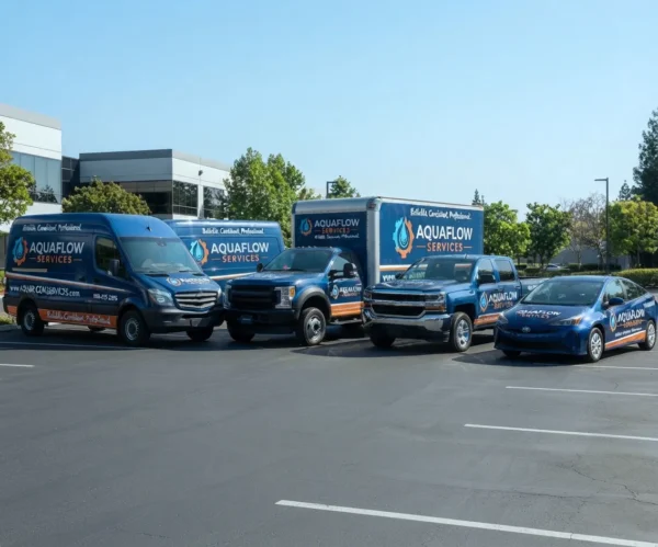
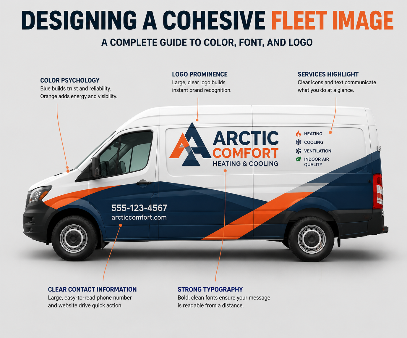
Your fleet is more than just vehicles. It is your mobile billboard. Every day, thousands of potential customers see your cars on the road. Does your fleet make a lasting, professional impression? Designing a cohesive fleet image is essential for building brand recognition and trust. A consistent look turns a simple van into a powerful marketing asset. This guide explains how to integrate color, font, and logo to create a professional and effective vehicle wrap design.
The Power of Color Psychology on the Road
Color is the first thing people notice. It grabs attention before they can read your name. Choosing the right colors is the foundation of designing a cohesive fleet image. Different markets respond to colors in similar ways, but cultural context matters.
In the US and the UK, blue often signifies trust and reliability, making it popular for service industries. In Australia and New Zealand, where businesses often aim for a bold, rugged look, earthy tones or bright, high-visibility colors work well.
- Primary Colors: Select one or two main colors from your logo. Use them as the dominant colors on the vehicle wrap. Consistency here is key.
- Contrast: Ensure high contrast between the background color and your text. A dark blue van with black text is unreadable. White text on a dark blue van is highly effective.
- Market Trends: In competitive markets like the US or the UK, a clean, all-white base with vibrant accents is a modern trend that looks premium.
Typography: Choosing the Right Font for Readability
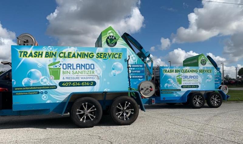
The font you choose communicates your brand personality. For vehicle graphics, readability is the most critical factor. A customer driving on a highway in Texas or a busy street in Auckland has only seconds to process your information. Complex scripts or thin fonts fail the “fast-read” test.
When designing a cohesive fleet image, follow these typography rules:
- Limit Your Fonts: Use a maximum of two fonts. One bold, strong font for the headline/company name, and one clean, simple font for services and contact details.
- Brand Consistency: Use your primary brand font. Do not pick a new, fancy font just for the trucks. This dilutes your brand identity.
- Size Matters: Company names should be large and visible from a distance. Phone numbers and websites must be clear, but they do not need to be as large as the logo.
A professional sans-serif font is generally the safest and most effective choice for fleet advertising across all regions.

Designing a Scalable and Professional Logo
Your logo is the face of your business. It must be designed for versatility. A logo that looks great on a business card might get lost on the side of a Mercedes-Benz Sprinter van.
When creating or adapting your logo for vehicle branding, simplicity is vital.
- Vector Format: Ensure your logo is a vector graphic. This allows it to be scaled up to fit a semi-truck without losing quality (pixelation).
- Icon vs. Text: Consider if your logo has an icon that can be used separately. Sometimes, placing the full logo on the door and just the icon near the rear of the van creates a balanced look.
- Clutter: Do not overcrowd the logo area. Give it breathing room.
A simple, clean logo is the centerpiece of designing a cohesive fleet image.
Bringing It All Together: The Deka Wrap Advantage
You have the perfect color, the right font, and a great logo. Now, you need to bring it to life on the vehicle. This is where the quality of the wrap material and installation matters.
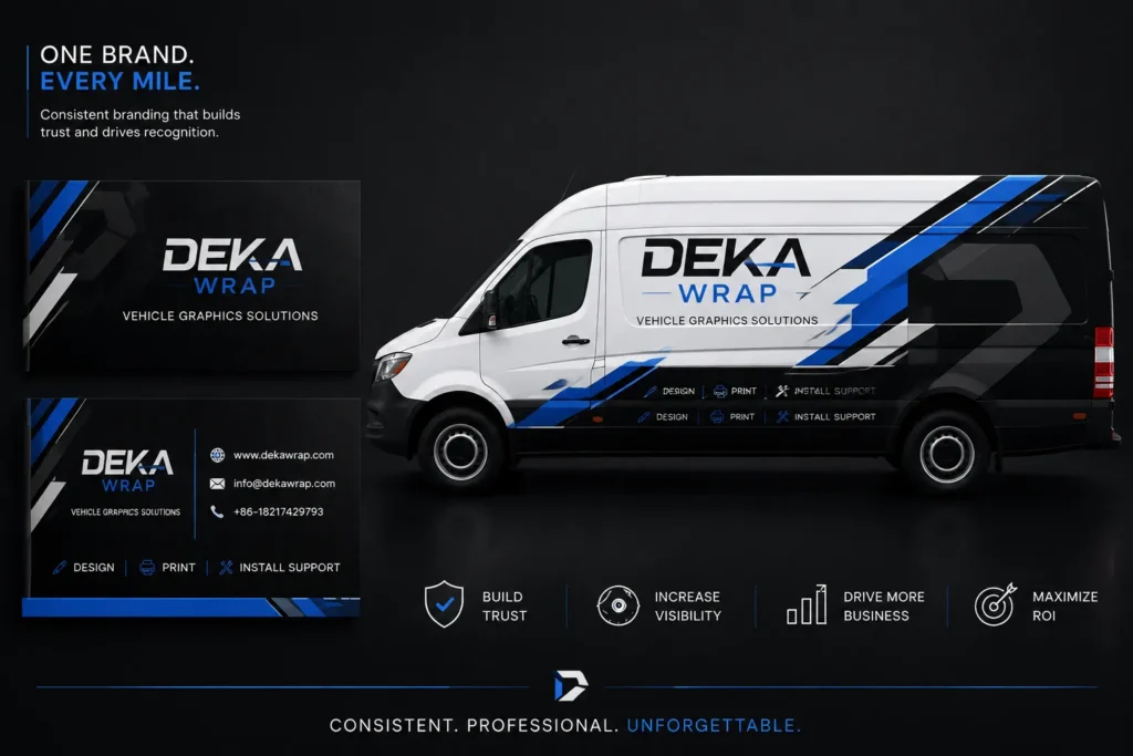
At Deka Wrap, we specialize in premium vehicle wrap solutions designed to make your brand stand out in any market, from the US to Australia and New Zealand. Our high-quality materials ensure that your colors stay vibrant and your graphics remain sharp, even under harsh UV rays. We understand that designing a cohesive fleet image is a significant investment. That is why we engineer our wraps for durability and easy maintenance.
A well-installed Deka Wrap protects your vehicle’s paint and ensures your message is seen clearly for years. Don’t settle for less than the best when it comes to your company’s image.
A Lasting Impression
A professional, branded fleet is one of the most cost-effective advertising methods available. It establishes instant credibility and makes your company look established and reliable. By carefully selecting your colors for impact, choosing fonts for readability, and ensuring your logo is scalable, you are well on your way to designing a cohesive fleet image. Remember, consistency across all vehicles, from a small car to a large truck, is what builds a powerful and recognized brand. Invest time in your design, and your fleet will work for you every single day.